01
BBC Three Studio Design
This project is about creating a set design for a late night light entertainment show on BBC Three, covering varied topics. Our brief described a small studio, live production intended for one anchor and guests, allowing us to explore and decide the title, the content of the show, the presenter and an overall concept, style and look/design language. We were asked to design all elements of the studio set, including a link area, a discussion area with guests and a performance area for music performers and other entertainment. We were told that the show would be broadcast from Studio 6 with black and white cycloramas available and that we could paint or vinyl the floor.
After the brief, I decided on my host first -- Joe Wilkinson -- and that I wanted to do a late night show. I thought that a good way to tailor the show to his personality would to have one that plays to the apathy of his comedic character on 8 out of 10 Cats Does Countdown: I decided to make my design themed around a private eyes office, where the private eye -- Joe -- is a lot less interested in investigation than staying in his nice warm office and makes the people he wants to investigate -- the guests -- come to him with their stories. My show’s title is Joe Wilkinson: Private ‘Eh’.
The first thing I did after that was create a moodboard. I looked at programs from BBC Three like Drag Race UK and other panel or late night shows like Mock The Week and the Paul O'Grady Show. I recognised a pattern in the lighting and was able to talk about it in the group crit -- blue, pink and purple lighting that I later incorporated in my design. One thing I took from the crit was to pare down my references which I did and this really helped with my design.
After that, I created rough sketches and thumbnails for the spaces in the brief: interview area, performance area and link. One thing I took from the final crit was to explore this stage further, which I agree with -- it would allow me to explore my ideas further. I think that my final design needs that extra ‘oomph’. One thing I decided to do was to put a chaise longue in the link. I think it evokes the era and yet contrasts the stereotypical PI-Noire-gritty aesthetic with Broadway sensibilities -- sort of playing to the dramatic personality instead, thinking about the ‘pillars’ of BBC Three as listed in the brief.
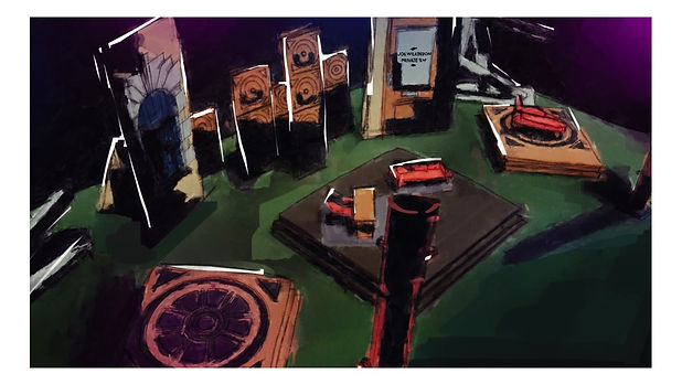
Next, I started to do rough modelling to bring my sketches to a 3D environment. Playing with levels and sections and foreground was really influential to the final look. I had the idea of having an office interior-feel on the ‘inside’ interview area and then petering out to an exterior construction aesthetic toward the performance and link areas. My inclusion of columns in front were inspired by research into the architectural design of a lot of the skyscrapers in NY, which are based off of columns. However, I decided to make them more cylindrical to reflect the shape language of the construction poles in the background. If I were to do this again, I would focus on the advice given in the final crit to push them back a bit to allow for camera movement. I would also incorporate the oversized panels into the construction equipment, perhaps drawing on the set of Newsies as a reference. The staggered square detailing in the back was an effort to get an idea of a skyline against the night sky of the cyclorama. Because there's a void, the vertical lines in my shapes aim to draw the eye down to the host.
To guide me on colour, I decided to create my final visuals in Procreate for iPad and Photoshop. I created the visuals by taking the mini-cam into my white model and drawing on top of it. My visuals illustrate my lighting, an overhead shot of the set, an example shot of the interview area and a shot of the link area. This is probably the strongest part of my project in my opinion, which I am very happy with as it had been a while since I had attempted digital art. If I had more time, I would have tried to include more people in my visuals to give a sense of scale -- I believe that the visual for the link area is the best as it has a person in it.
Before constructing the final model, I created some digital graphics to use on the set. I used a mixture of Illustrator and Photoshop to make them. For the design, I did some research on the sort of shapes that you can find on buildings on the East Coast of the US where a lot of these Noire narratives take place in film. The model is a piece I definitely want to redo for my portfolio as I am a bit inexperienced in model making. I decided to have a limited colour palette in order to tie the mise-en-scene together. I used colours with darker values and a greyer chroma along with a black cyclorama to evoke an atmosphere of secrecy and amplify the idea of a night skyline. I added a pop of cherry red colour throughout -- a more playful contrast to emphasise that this isn't a tonally moody show. I hoped this made the set seem a bit more artificial and the use of it pulls attention toward where the guest and host will be sitting.